Thursday 2 November 2017

OUGD602: LRFS - Initial Planning

- researched concepts for all scenes to understand the direction
- heavy discussion with directors and mood boards produced
- weekly Monday meetings (6-8 with whole committee discussing progression. Good way to keep on track and make sure things are getting done. I had weekly stylists meetings on Thursdays where we'd discuss designers and how many designers and looks we had pinned down.)
-Researched Japanese military wear
-researched African millitary
-researched European military wear

- researched makeup
- researched hair styling
- researched model poses for end of runway
- researched cool runway ideas
- researched accessories (Britney snake VMA/Gucci inspo)
- researched peace symbolism, tranquility and CND/1960's
- connotations of white, look for alternatives to bridal to achieve floaty look
- resolve direction for Peace

- researched high fashion brands and PR agencies
- created budget
- updated google drive with new folders and content, shared with stylists, PR, model managers etc
- meeting with LCA designers and alumni, Priyanka, Naomi Chew, Alice Green, Alice Callum, Eden Keisha, Zlata Alekeno and Monica Birzan
-produced designer package to explain ideas to designers and try to get their pieces to use in the show


Thursday 12 October 2017

OUGD602: Harrison France (Marshlands Collaboration)

After the success of the first shoot, Harrison asked me to do more styling on his upcoming shoot, which will hopefully end up as an editorial piece. We were in communication a lot as Harrison had a very clear idea in his head for how the shoot should look. We decided together that each look should be either purely black or purely white, reflecting the location we both chose together. We shot on Saddleworth Moore, allowing vast open spaces and a variation of different locations (all within a short-ish distance, easy parking and no permission required to shoot). The concept behind the styling was to represent good/evil, truth/lies, honesty/deception, highlighting the history of the moors murders.

Learning from the last shoot, I took more items which could be interchanged (yet this was actually a bigger hinderance than benefit- too much choice = too confusing). I have now learnt not to do this in the future. I also decided to do an inventory of stock taken for this shoot. As I work part time in a jewellers I asked to borrow some pieces (totalling over £1000) so felt this was a necessary precaution. I felt doing this made me more organised as I could see physical lists of what was there/on the model, and what was remaining. I will continue to do this for future shoots.

This time I also felt like a small cogg in a much larger team, all brought together by Harrison. The model Gabi has been signed to J'adore models in Manchester for a few years, and was alot friendlier than I expected, which was a pleasant surprise. I also had the benefit of working with Leeds based Kat Von D makeup artist Abi Hylton- we all switched details and said we should definitely collaborate again in the future. I realised from this that I am really good at working in small teams, as this allows you to bounce ideas off eachother and i'm not so 'in my own head' as much. This is definitely something I want to continue professionally. 


OUGD602: Harrison France Collaboration 01

After seeing a post on Instagram requiring a stylist for an upcoming shoot (3 days notice), I decided to respond and get involved. Harrison France (@hazfrance), 2017 photography graduate posted the request. Harrison specialises in fashion photography and throughout the third year I really admired his work, yet didn't have the confidence to ask to collab. As my employment background is in personal shopping for Topshop, I knew this is a role I could execute effectively within the timeframe, as well as a way to work with someone I really looked up to.

The went really well and was a first test shoot for 'Louise', a newly signed model to milk model management (London based). Prior to the shoot Harrison sent me over all her measurements/sizes, it was then my responsibility to source and compose the looks, taking into consideration props and making the model feel comfortable. I was really worried that the clothes wouldn't fit/look right on her frame, yet after putting her in the first outfit the clothes came alive and the worry went away. I now know I need to trust myself and my skill in sizing and what will look good on other people.

I learnt lots of styling tips from Harrison, including ways to protect footwear in order to return to stores/not damage in any way, which is useful when considering any future shoots.

Harrison, Louise and MiLK were all really happy with my work on the shoot and asked me if i'd want to do more work with them in the future, to which I definitely accepted! I had so much fun and feel like a weight has been lifted from my shoulders as this is a fashion centred role (what I always dreamed of doing), i'm good at it AND theres a demand! Result. 

After posting the images to Instagram and sending them on to MiLK, they were picked up and featured by Knots Magazine, appearing in their Sept 2017 printed edition and on their Insta!


(A few of the images ...)


Monday 8 May 2017

OUGD502: Creative Report Evaluation

The creative report did not print right and has not even executed to any form of acceptable standard to be currently sent to professionals. I should have given myself more time for printing, but now know how stressful that can be and will take more time out to print in the future. I thought it would be easy, just doing a double sided print, however when trying to re-do it on the uni computers on my own stock for heightened texture and quality, the prints kept going wrong (literally 30 misprints, totalling £13)!! I hate printing and have learned that this is not an aspect of the graphic design industry I want to be part of. I created a double sided poster just to create a tangible graphic artefact, easily distributed and concise in its execution. This did not go wright, but I will continue to try and print better in the future and will send Kate a copy on nice stock, with professional folding. I have also noticed a typo I corrected but didn't save the changes to, meaning that the final print is not the final solution either way- I blame this on my own organisational skills at the Minuit. I have tried to improve these throughout the year but in times like this it really let me down but I have really enjoyed constructing the two sided poster none the less.

The photographs are also not up to standard due to time restrictions- something I need to. budget for time for in the future.


Sunday 7 May 2017

OUGD503: Evaluation

Throughout this year I have learn't I am much more productive, proactive and interested in design when it is not for myself. I see little value in the work I produce unless it has a purpose, its all very well and good to produce a fancy book for myself but unless that will be distributed for others gain or personal profit, what is the point? By doing collaborative work I have improved knowledge of dealing with clients and have since been selected for paid jobs just from word of mouth and how fairly I treat clients, which has been more beneficial than anything. By being proactive on the collaborations page and taking control of my own learning, I have networked vastly amongst LCA, getting to work with a range of photographers and fashion students- my two main areas of interest carrying my practice forward. Interviewing Kate made me realise that typography is not an area of advertising, so perhaps it is outside of advertising where I needed to look. 

I have learnt that by knowing history, knowing historical references and the work produced by influential designers, the appreciation for good design increases vastly. By observing design in detail, both critically and contextually you can apply those ideas and thought process onto your own design, allowing influence and room for play. The aspect of aesthetic quality is just as important portfolio wise as a strong concept, as the visual is the hook for a deeper conversation. By exploring collaborative work I have had to be more proactive about project management and improving my time keeping to manage around other uni led briefs. The experience this year with D&AD has been really enjoyable, after researching them at the start of the year I felt they would just be a blood sucking money corporation, however after attending the festival and seeing some mind changing speakers, it was clear they really do want to help put design students and professionals on a raised creative platform, which is something I want to strive to be part of in the future. The collaborative aspect introduced me to New Blood, a competition I am most proud of which also aided to my development in project management. Incorporating photography and illustration, the Monotype brief was a perfect representation of the power of collaboration and how I had a role in a group, which is something I've often questioned until now. The photographic aspect made me consider a much more technical aspect, as well as editing under time restrictions and painting standards and protecting concept throughout- all of this has led to me having much more confidence in my knowledge and ability, both technically and contextually. 

Last year I mentioned how my illustrator skills were not that strong, and this is something I have worked to improve throughout the year. After attending the Life After College Business program in summer, it was clear Graphic Design was a business- and how to make that business work for you is the most critical point I wanted to explore. Finding my way in the creative industry is a maze, however I feel the direction I am going in IS a direction, and is directly revolved around visual imagery, typographic and illustrative content. The emphasis of fashion is something I need to incorporate more, as looking to the future I want to be working in and living that kind of lifestyle. Ever since I was young I have wanted to work in fashion, and I feel by not pursuing that route it would be giving up on something which could be a possibility with enough effort. 


My personal experiences throughout the year have taught me to be much more skeptical of people, including clients and collaborative partners, whom (if negatively chosen) has the possibility to increase stress to maximum levels- something not needed when clashing with university deadlines. 
However, ironically I have discovered project management and helping others is my forte, I can use my skills of networking to benefit others by putting them in contact with other necessary collaborative partners, which could lead to a graduate creative agency, helping make these connections.  Interests in typography have also progressed this year, inspired by Paula Scherr and Michael Wayne have come through more in my practice this year, starting more computer based and moving away from the screen over time. The jewellery making course was another invaluable experience as it allowed me to focus on craftsmanship, something I set myself as personal goal in the 504 brief. This can develop into 3D typography and creating opportunities for myself to create branding, online shops to generate a business and a way to offset the course work with something less concept driven and hands on.

The Studio Brief 02 part of the moduel has given me the confidence to continue contacting practitioners in the future, documenting and recording all interviews with the possible hope of producing a full, decade spanning archive of talks from creatives throughout my career. Advertising is already starting to be an area I am loosing investigative focus in, but know that the possibility of working in advertising provides a decent salary and access to a global platform to help shape positive ideologies, harnessing advertising for good.


I have also learnt that getting your work out their and getting interest in you as a person is extremely important, so partaking in additional briefs to aid your portfolio is essential. I also want to attend more crit's and be proactive if necessary in organising crit's. The aspect of project management has been something I have come to consider as a key skill I have developed, having learnt the ability to manage large groups of people logistically, improving time management and organisational skills. I enjoy the responsibility of leadership roles, and when there is some pressure on my shoulders I feel the need to preform well is heightened, motivating me to do the job well. The responsive model was hard for me, as I was prioritising the freelance work for other briefs and aspects (e.g.: jewellery), so it was hard to focus on the Greenall's brief especially as I was prioritising that last due to the far away deadline. Remembering this in the future, I need to consider time plans for university work as I do for collaborative practice, as that seems to be the area's I can thrive in. 


In conclusion, in one way it is good that I am more motivated by other people's work than my own, as when working in industry this will be the case. Over the summer I plan to partake in personal projects, including the collaborative fashion zine, my first jewellery collection, personal branding and potential placements. I have applied for aprox 13 placements at the minuit, mainly based in London using Kate's advice. Looking back at D&AD, I regret not taking the opportunity to ask Craig Oldham some preplanned questions, not just stumbling and being quite unorganised. It would have been good to get Craig's email or get him to remember me somehow, in order to contact as a Northern contact, investigating both scenes. Furthemore, b
y doing the recent experimentation in the ZOG branding process, I have discovered deep interests in typography and real enjoyment through attention to detail. I am quite a messy person, all of my work is never fully perfect when conducting my own practice, yet when the output changes and the purpose is for the client, there is a real shift in my perception towards the brief and my senses to design heighten to consider more aesthetic details, something I have learnt the value and necessity of through visiting talks from influential designers, including Stephan Sagmeister, Mike Rigby, Kate Allsop and Ruth Johns.  I have honestly done so much this year I don't have the time to blog about it all, which again is something I need to improve in Level 6 to fulfil my academic potential.

OUGD502: Creative Report (Interview FULL)

OUGD502: Producing the Creative Report


I wanted to include a small amount of hand rendered type which received positive feedback in my PPP Presentation, so felt this would be appropriate to continue in the creative report. As the intro is the aspect where I discuss my personal rational for looking at Kate Allsop, I thought this would be the most appropriate place to include this typography. I find this method of crafting really therapeutic, with the clean use of black and white possibly inspired by Matthew Wayne- someone else I respectively should have interviewed. 

Already constructing the outcome I have learnt I should have been more proactive in the earlier months of 2017, researching more influential people and pursuing more interviews from relevant and influential practitioners, including Matthew Wayne.

~* SEE SEPERATE BLOG POST FOR PDF OF FULL CREATIVE REPORT & SPREADS *~

After constructing the editorial and printing the simple composition of the type campaign, I didn't feel that it was enough for a sufficient submission. I felt that by developing the resolution and combining both aspects, I would be able to present more of the information in a more concise way.

I considered creating a double sided poster, stemming from the idea of the Real Women print. This can be folded as a little booklet, easily transported and distributed, and efficient in utilising space and layout. By investigating with this I was able to explore a range of folding techniques, using my brain to work out measurements and making sure they were accurate so the poster would print right. This attention to detail has been proven to be needed, with almost all influential speakers talking about this as a key skill for success. Planning has become vitally important in my practice, and even simple exercises like working out this folding is helping me develop little skills like this.


Setting up the document so it would work when folded, in the easiest way possible. I thought logically, breaking the problem down into simple steps, and splitting the page into two halves, with 1/4's in the second half. The formatting of this document was fairly easy, however condensing the content was quite challenging, as I wanted to keep the most interesting responses from Kate, as well as the questions most people may want to get answered.

I plan to print on a coloured A3 or A2 stock, creating a large scale poster on the flip side from the Real Women illustration. 


Prestige Elite typeface, Serif and typewriter-esq, denoting a crime report or 'creative report', yet still very minimal and not very creative. 

Experimenting with possible self branding. I wanted to highlight the use of this information for personal, informative use, rather than large scale publishing, so thought I'd name it exactly what it is, rather than an ambiguous name like 'steps into advertising' or 'advice from Grey' etc etc. 

OUGD502: Producing the Creative Report

Initial ideas for displaying the creative report
  • Include a range of interviews/advice from creatives, including all areas of personal interest- including Kate Allsop (Grey London), Benjamin Craven, all of the D&AD speakers including elements of Stephan Sagmeister's Q&A and talks from Craig Oldham and Mike Rigby. I could also include advice from Helen Russell and the instagram designers I have contacted
  • The above idea could also be simplified to just look at advertising and illustration, all combined into editorial content, combining three of my main interests, yet to pursue this it would be more relevant to also interview a photographer or editorial designer to have a more holistic link to my own development and learning throughout the year.
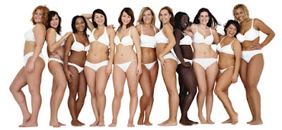
  • Create a poster, reappropriating the Dove Real Women advert, focusing on Kate Allsops interview. Place the typography into the shape of the women in the advert, constructing the interview into Kate's advertising environment- most 
  • Creating an editorial showcasing the interview with Kate Allsop at Grey London. I feel that her interview was the most full and useful to me personally, sharing many experiences other people may be interested in hearing about, as well as giving quite controversial advice at times. This does not have to be printed necessarily as Kate's practice doesn't focus on print necessarily.

Feedback:

I showed the interviews to some peers and asked for their advice on what to include
- Focus on Kate Allsop, not a lot of people will have access to her or look at advertising
- Do whatever's most relevant to your practice
- Display the content in a way you feel your style is progressing in, using the persons medium, e.g.: Advertisement for Kate, illustrative for Benjamin.
- Including D&AD speakers may become overcomplicated and irrelevant as you haven't directly interviewed and asked the speakers--does that count??
- The idea of having it as an advert is clever... an advert is designed to inform more people and reach a wider audience, telling them about a product, so putting the interview in this space is going against how it is normally presented, going against the grain.

To go about creating the creative report I wanted to focus on Kate Allsop, putting the interview in her setting, using her most famous campaign as a template. This advert resinates with me personally, I vaguely remember the campaign and I feel it is really important to tackle social issues, such as unrealistic presentations of women in visual communication and beauty/fashion in particular, creating negative implications in society. Also, the possibility of a placement at Grey means that it would be good to send her a copy of the final piece as a thank you for taking part!

Exploring compositions 01- The interview would be typeset in the positive space of the women. This advert crop shows a wider composition of the women, meaning the line lengths could be longer in the centre. It could be interesting to suggest the bikini/leg shapes, yet I don't want to somehow sexualise the typography and disrupt the legibility. 

Exploring compositions 02- Much fewer women with a more varied spacial awareness, creating a more clear silhouette of a group of women. Looking at the interview, the aspect relating to real women is quite short (when slightly refined), so keeping the typography tight to highlight the suggestion of human features may be more interesting for the viewer, as well as displaying all the information in a clear (hopefully legible) manor. 
 I tried to split each piece of information up into groups, with each figure representing that group. I considered letting the line lengths run fluidly, as naturally thats what the eye wants to do, but as this is a personal exercise, I want to take the opportunity to be creative and create something unique to Kate's practice.


 Using digital methods was not going well, it was taking so long to get each letter warped in the right way, I did't feel that the effect was worth it. I chose Helvetica Neue relating to the Dove Real Women typography, an extremely legible font juxtaposed by its usage in 6pt warped human forms. Learning from past experiences, I prefer creating illustrative compositions (and often typography), by hand, so after seeking some more brief feedback I chose to move away from the digital rendering and go back to pen and paper.


Dove Real Women section of the interview, returned into the format and silhouetting the women. The formal structures and rivers don't look as good as planned, but I used the thought process of those deconstructing typography, cutting off words half way with a hyphen as well as curving some words to follow the flow of the body. I needed to incorporate a thin gutter between each women to define the shape. Craig Oldham said if you were going to do a parody, do an accurate parody 

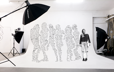
TESTING// Checking the illustration still looked like women from a distance.. I sent this photo on a social platform to about 30 Graphic Design peers.. 27 of them said it did look like women and I targeted the remaining three for feedback in order to improve the design.


 Feedback:

I asked 10 people if it looked like the shape of the advert 
I asked, should I print this as a simple poster/advert? 
Put it in a studio environment and print that as a poster/advert? 
Combine the full interview in somehow (as i'm worried this may not be a full 500 words??)

- Just showing the illustration on its own shows the simplicity
- Hand rendered type looks extremely personal so it doesn't need to be formalised
- It would be funny and personal to photoshop yourself next to the women, as i'm a real woman too and conducted the interview.
- Definitely include the full interview, it won't be enough on its own
- Women looks abit like an amputee with a spike leg, so soften the corner of the type.
- 'Crime profile on advertising'

First mock up of a possible setting, using the official advert template and typography, removing the product and Dove branding, replacing it with Grey's, and a possible stamp identifier I am experimenting with for my own branding. 

Comical and personal but looks much better with a simple composition. Quite unprofessional but I wanted to use Kate's advice of humour.

Presenting the issu document as an online editorial, presenting all the information and illustration in setting. This will allow me to show all the information in a more creative way than just a standard pdf, exploring areas of personal interest and experiment with design. I enjoyed experimenting with layouts and experimenting with grids.