Initial ideas for displaying the creative report
- Include a range of interviews/advice from creatives, including all areas of personal interest- including Kate Allsop (Grey London), Benjamin Craven, all of the D&AD speakers including elements of Stephan Sagmeister's Q&A and talks from Craig Oldham and Mike Rigby. I could also include advice from Helen Russell and the instagram designers I have contacted.
- The above idea could also be simplified to just look at advertising and illustration, all combined into editorial content, combining three of my main interests, yet to pursue this it would be more relevant to also interview a photographer or editorial designer to have a more holistic link to my own development and learning throughout the year.
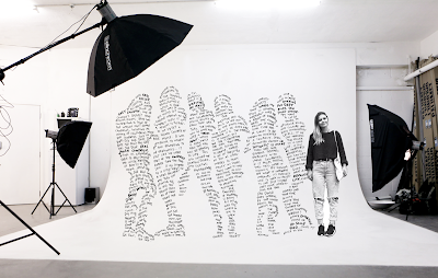
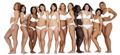
- Create a poster, reappropriating the Dove Real Women advert, focusing on Kate Allsops interview. Place the typography into the shape of the women in the advert, constructing the interview into Kate's advertising environment- most
- Creating an editorial showcasing the interview with Kate Allsop at Grey London. I feel that her interview was the most full and useful to me personally, sharing many experiences other people may be interested in hearing about, as well as giving quite controversial advice at times. This does not have to be printed necessarily as Kate's practice doesn't focus on print necessarily.
Feedback:
I showed the interviews to some peers and asked for their advice on what to include
- Focus on Kate Allsop, not a lot of people will have access to her or look at advertising
- Do whatever's most relevant to your practice
- Display the content in a way you feel your style is progressing in, using the persons medium, e.g.: Advertisement for Kate, illustrative for Benjamin.
- Including D&AD speakers may become overcomplicated and irrelevant as you haven't directly interviewed and asked the speakers--does that count??
- The idea of having it as an advert is clever... an advert is designed to inform more people and reach a wider audience, telling them about a product, so putting the interview in this space is going against how it is normally presented, going against the grain.
To go about creating the creative report I wanted to focus on Kate Allsop, putting the interview in her setting, using her most famous campaign as a template. This advert resinates with me personally, I vaguely remember the campaign and I feel it is really important to tackle social issues, such as unrealistic presentations of women in visual communication and beauty/fashion in particular, creating negative implications in society. Also, the possibility of a placement at Grey means that it would be good to send her a copy of the final piece as a thank you for taking part!
I tried to split each piece of information up into groups, with each figure representing that group. I considered letting the line lengths run fluidly, as naturally thats what the eye wants to do, but as this is a personal exercise, I want to take the opportunity to be creative and create something unique to Kate's practice.
I asked 10 people if it looked like the shape of the advert
I asked, should I print this as a simple poster/advert?
Put it in a studio environment and print that as a poster/advert?
Combine the full interview in somehow (as i'm worried this may not be a full 500 words??)
- Just showing the illustration on its own shows the simplicity
- Hand rendered type looks extremely personal so it doesn't need to be formalised
- It would be funny and personal to photoshop yourself next to the women, as i'm a real woman too and conducted the interview.
- Definitely include the full interview, it won't be enough on its own
- Women looks abit like an amputee with a spike leg, so soften the corner of the type.
- 'Crime profile on advertising'
 |
| Comical and personal but looks much better with a simple composition. Quite unprofessional but I wanted to use Kate's advice of humour. |
Presenting the issu document as an online editorial, presenting all the information and illustration in setting. This will allow me to show all the information in a more creative way than just a standard pdf, exploring areas of personal interest and experiment with design. I enjoyed experimenting with layouts and experimenting with grids.


No comments:
Post a Comment