I wanted to include a small amount of hand rendered type which received positive feedback in my PPP Presentation, so felt this would be appropriate to continue in the creative report. As the intro is the aspect where I discuss my personal rational for looking at Kate Allsop, I thought this would be the most appropriate place to include this typography. I find this method of crafting really therapeutic, with the clean use of black and white possibly inspired by Matthew Wayne- someone else I respectively should have interviewed.
Already constructing the outcome I have learnt I should have been more proactive in the earlier months of 2017, researching more influential people and pursuing more interviews from relevant and influential practitioners, including Matthew Wayne.
~* SEE SEPERATE BLOG POST FOR PDF OF FULL CREATIVE REPORT & SPREADS *~
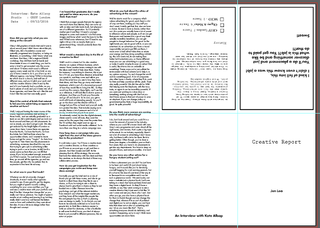
After constructing the editorial and printing the simple composition of the type campaign, I didn't feel that it was enough for a sufficient submission. I felt that by developing the resolution and combining both aspects, I would be able to present more of the information in a more concise way.
I considered creating a double sided poster, stemming from the idea of the Real Women print. This can be folded as a little booklet, easily transported and distributed, and efficient in utilising space and layout. By investigating with this I was able to explore a range of folding techniques, using my brain to work out measurements and making sure they were accurate so the poster would print right. This attention to detail has been proven to be needed, with almost all influential speakers talking about this as a key skill for success. Planning has become vitally important in my practice, and even simple exercises like working out this folding is helping me develop little skills like this.
Setting up the document so it would work when folded, in the easiest way possible. I thought logically, breaking the problem down into simple steps, and splitting the page into two halves, with 1/4's in the second half. The formatting of this document was fairly easy, however condensing the content was quite challenging, as I wanted to keep the most interesting responses from Kate, as well as the questions most people may want to get answered.
I plan to print on a coloured A3 or A2 stock, creating a large scale poster on the flip side from the Real Women illustration.
 |
| Prestige Elite typeface, Serif and typewriter-esq, denoting a crime report or 'creative report', yet still very minimal and not very creative. |


No comments:
Post a Comment