Gambit is a new business providing cyber security for small/medium size companies. They are forecast to take off come September 2016, and have asked me to design a small, simple corporate identity for them. Based in Blackburn and ran between two people, they are aiming to provide their service locally, then grow when word spreads as they feel this is the best form of promotion.
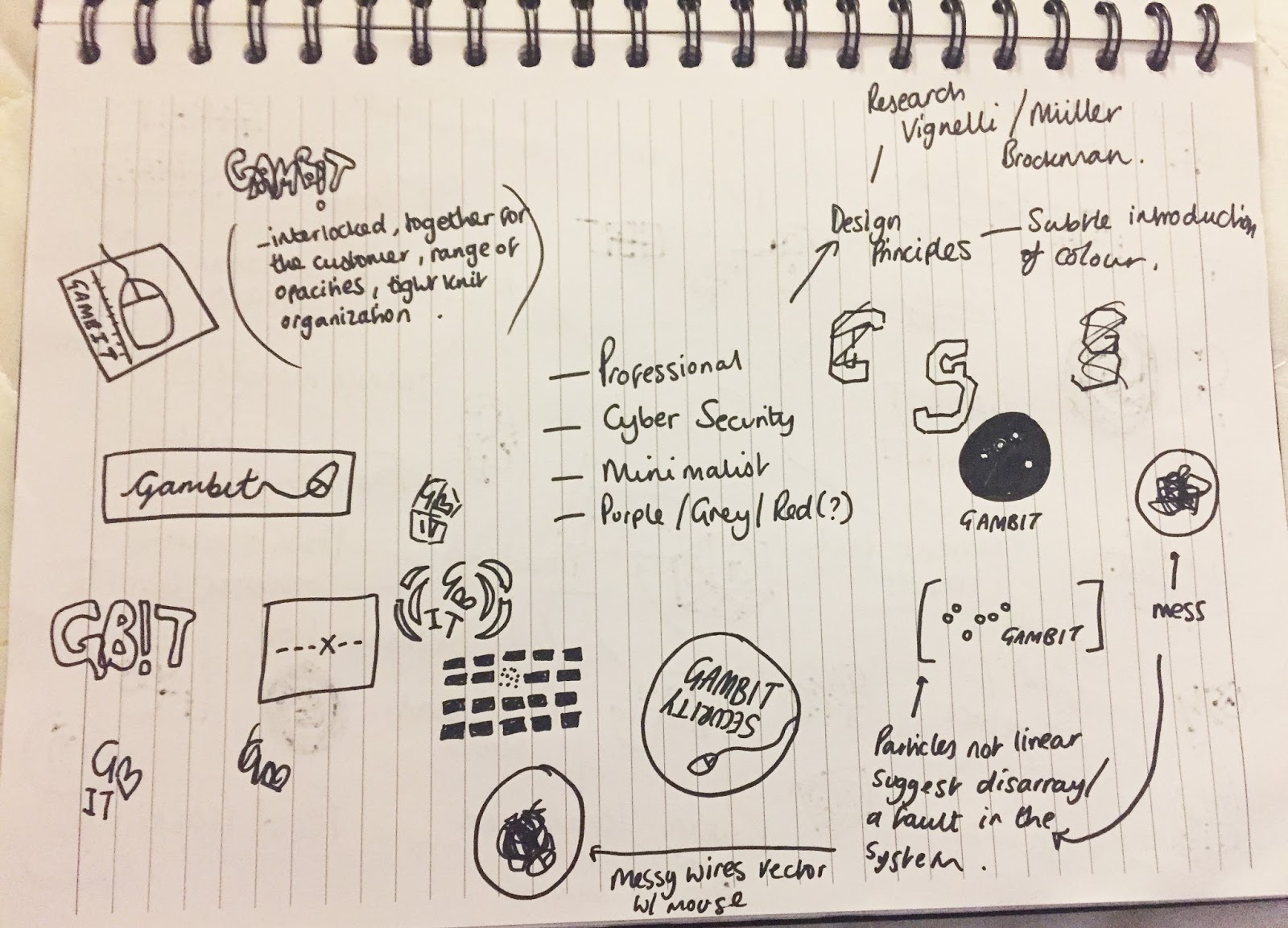
Being sole-trader lead, it is essential the company oozes professionalism, thus illuminating any distrust on behalf of the prospective clients. Adam, the main owner, is very clear he wants a Serif typeface from his personal preference, yet has left the rest of the brief vastly open. When we met to discuss the brief we made some rough ideas and mind maps as a starting point.
My personal intention for this brief is to create a solid identity, reflecting the companies values and down to earth service intention, in the most sophisticated manor possible for the technology genre. Gambit essentially means "an act or remark that is calculated to gain an advantage, especially at the outset of a situation", alongside being a Super hero prominent in American comic books. I could perhaps utilise the actual definition and incorporate connotations of success (e.g.: use our cyber security and your business will become more successful) through future design decisions.
 |
Investigating who they are, what they will be doing and how they will be executing daily working life. It is notable that initial communication with prospective clients will be made the old fashioned way, visiting businesses and sending letters- meaning letter heads/ templates need to be produced. |
 |
|
After producing some initial sketches, I met with the client again to discuss what is tangibly needed, so I can tailor the design styles and decisions towards the requirements. We came up with a range of ideas, yet narrowed down the main criteria:
// Logo
// Unique Pattern or Letterform
// Business Cards
// Lanyards and I.D Badges
// Welcome Pack and contents... Pen/ Booklet/Post-it-notes etc
// Mock up website and Web Icon (?)
// Letter heads and over envelope stickers
 |
| Playing on the molecule idea, suggesting a contemporary and scientific approach, I traced 'Gambit' in the clients ideal typeface, Cochin. The effect the dots created are naturally clustered in places, and when they eye is relaxed the word Gambit is still slightly visible. To alter this I can increase spaces between some clustered dots, aiding composition and creating a sporadic ascetic, relating to the fast pace of the industry. In the previous meeting, I was also advised that a deep, dark shade of purple along with a Serif typeface would be favourable. We decided on Pantone 98-16 C, providing a subtle difference from black. |
 |
Experimenting with a range of compositions inspired by the circle, using the selected Pantone. In this sense, the circle represents a sole trader out on his own, with connotations to wholeness/trust/family, suggesting a positive emotional message. This is backed up by many theories, most interestingly put in 'The Psychology of Logo Shapes' - http://www.creativebloq.com/logo-design/psychology-logo-shapes-8133918.
Exploring typefaces, kerning and leading. The leading in No.14 is far too loose between the bottom two lines, with the intention of a justified alignment throughout. Exploring the use of uppercase vs lower case with regards to professionalism and compositional ascetic. It was clear that for this project a capital G is essential, due to the strong professional message a capital implies. It also suggests a higher education, as the unknowing viewer could simply assume this was a mistake, not a design consideration- something I wish to avoid through Gambits branding. |
 |
| Possible resolution concluded to be unsuccessful. The lower case G/C/S does not connote Gambits intentions, therefore unfit for purpose. However, the justified alignment is a success, and praised by the client. |
// Possible Pattern Ideas
 |
Inspired by the circular trace of Gambit, I adjusted the compositional factors by manipulating the condensed sections, therefore creating a elongated placement print. |
 |
| Possible repeat option. Far too clustered with obtuse areas of negative space. Further manipulation would be needed if I carried this further, yet I feel I could create something more unique and bespoke to Gambit. |
 |
| Further experimentation from the previous repeat pattern. Reduction in scale and repeated further, possibly for a lanyard design/ the reverse side of a business card. With a relaxed eye a naturist ascetic is created, as from some perspectives each section looks quite leafy. Again, this is not relevant to Gambit, nor the branding intentions to add an environmental spin, therefore will also not be considered. |
 |
|
 |
| Experimenting with a San-Serif bold G. This was initially just a brain storm for ideas generation, yet proved to be insightful and justified. I started with a San Serif, 'The Bold Font' to suggest power, modernity and the strong place Gambit aims to achieve within the local technology market. Again, the psychological relevance of a circle seemed the most appropriate way to experiment with monochromatic positive/negative space. By placing a white G on the edges/ rotated, a range of interesting spherical shapes have been created, especially where the G's right angle looks slightly like an arrow. By rotating No.3 90 degrees counter clockwise a Lock icon has been created, suggesting security... |
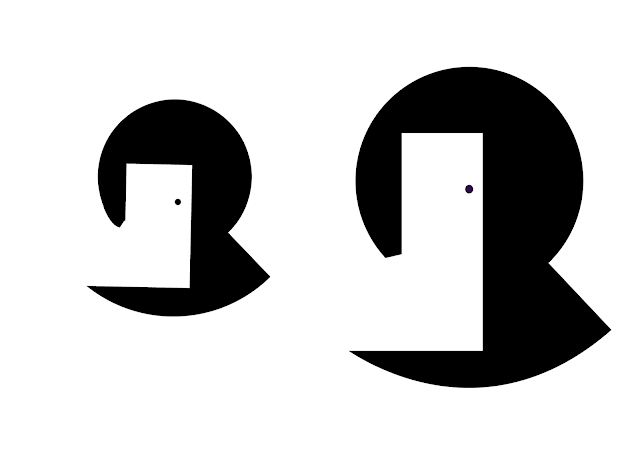 |
| Extending the result of No.3, I vectorised the lock symbol as a whole in two ways, experimenting with scale, yet keeping in B&W for now. When asking peers for feedback, they said it resembled a door/gateway, so I added the small circle representing a door handle. The door is now representing a way to achieve excellent service, with the white negative space connoting brightness and subsequently subconscious positivity. Despite this, I personally don't feel this is the most relevant way to project Gambit. |
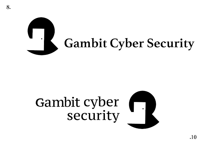 |
| Compositional exploration using the previous logo. Despite not having an intention to continue with the door reference, the unusual shape seemed appropriate to use when experimenting with further type compositions to consider versatility. No.10 is by far the least successful due to my attempt at making the capital G the same X-Height as the rest of the standard letter forms. This has created a ransom note style through inconstancy, both width and stroke. (Note, no 9 was deleted and placed on a different slide). |
 |
Inspired by the dot trace of Gambit, I overlaid rectangles to cover the width/hight of each individual letter, intended to create a graph like ascetic. Unfortunately, this did not work out as well as planned and looks more like a broken skyline than justified logo design. I explored a vertical composition to see if this amended the problem, yet after attaining more feedback it was clear it did not.
Below is another possible outcome created with one of the initial circular compositions. The white G has been rotated and placed on its side to create an subtle and ambiguous representation. I modified the Gambit to typeface Marion, a stronger alternative to Cochin with the similar serif elongations and historically cemented ascetic. |
 |
Experimentation repeat pattern for Lanyards |


No comments:
Post a Comment