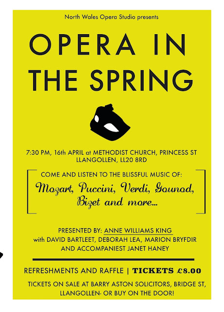
Due to the quantity of information, it was evident I needed a simplistic style, complemented by easily communicated visuals to add a further level of intrigue. The poster has to be A4 portrait. I have not been asked to consider printing costs, yet by designing in CMYK and keeping colours minimal I hope to aider to the simplistic style needed, whilst keeping ink costs lower to maximise profit.
The above are unsuccessful due to legibility ETC....
 |
| Most resolved... |
After emailing my resolutions to the client, I tried to keep my tone friendly yet professional, trying to look at the work from an objective point of view, so if they didn't feel the colouring/style was what they were after, they wouldn't feel bad telling me. I feel that emailing with clients in this style is significantly lowers the tension of the conversation, whilst making the client feel in control- so hopefully they may call on me more!
*Note, I wouldn't normally include a smily face on the end of the initial message, yet I am very familiar with the recipient so felt that this was ok.
 |
Response of initial work //
Selecting Design No.2, additional requirements and information they want to include
// After completing the requirements to the clients specifications, I had to alter the layout/text sizing slightly for this to flow effectively down the page, whilst trying to avoid heavy blocks of text with little negative space. I feel this would disengage the viewer, as the whole point of a poster is quick information, fast.
With regards to the bold type, I experimented with changing Futura to Helvetica Bold giving a clearer and less-condensed letterform. Unfortunately this did not really work, the X-Heights were inconsistent throughout and the overall scale of the Helvetica overshadowed Futura. In addition, the use of Helvetica, Futura and the custom type as the heading would mean three typefaces and 4 different type sizes would be being used. To resolve this, I used Futura Condensed Bold, yet adjusted the kerning to be wider set, allowing a continuously fluid composition.
As I want to create a clean, almost contemporary style creating a subtle juxtaposition with the subject content, I feel this went against design rules specific to this design style, e.g.: Massimo Vignelli states in his Canon that 2/3 of pt size and typefaces are an absolute must. For me as a evolving designer it was important to stick to these rules, allowing me to produce systematic design work that almost everyone can relate to/ older audiences can appreciate.


No comments:
Post a Comment