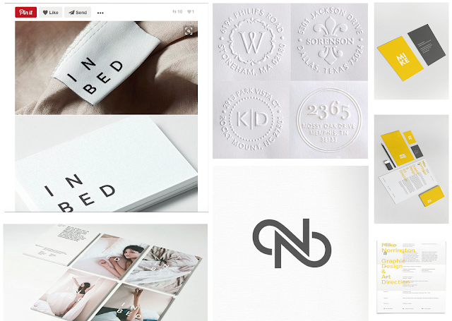
From my research I concluded I wanted to explore minimal but attention grabbing forms of communication. The IN BED project was perhaps my most influential with regards to type connotations, due to the sleek modern suggestion contrasted by a subtle nostalgic mood.
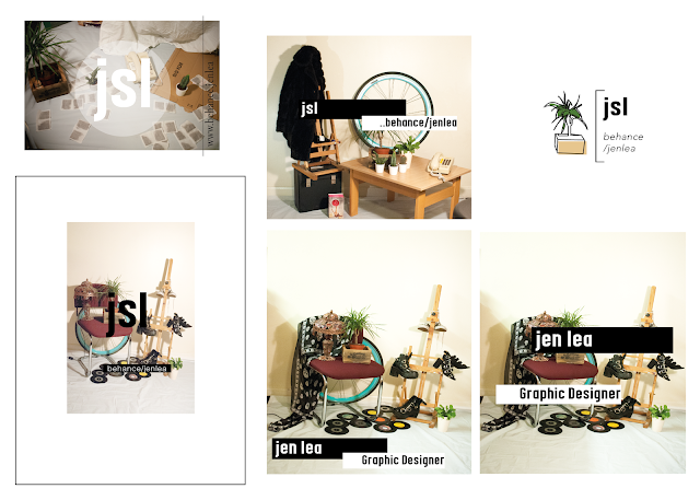
The use of photography in the IN BED advertisements possibly subconsciously lead me to conduct my own photoshoot, overlaying place holder text of a possible brand. This was my first set of compositions yet I feel they lead to a successful discovery when settling on the tag 'plant life creative', implementing my favourite plant Betty as my icon. This simplistic approach fulfilled my initial intentions, whilst relating to my personality and offsetting my brand away from a 'student' disregard. Despite this range of compositions not necessarily being the most professionally conducted, they definitely served their purpose as a starting point, leading me to the plant concept.
After this came the brand guidelines. Instead of guessing who I am I asked a range of peers, both within the design community and without which colours best represented me as a person. My typefaces were chosen to echo modernity (DIN), juxtaposed with a hand rendered nostalgic quality (Courier). The type is naturally an integral part of my identity, with Din being used for headers and important information, whilst Courier is only intended for body copy due to the type writer effect giving off a traditional vibe, tight kerning is preferable to keep consistency and reduce the line length.
My aim for self branding was to represent who I am as a designer at this stage within practice. I am very conscious that I am new to the subject, having come from a very expressive and textile based background I was attracted to graphic design due to the ease of printing, rather than embroidery or traditional printing. Because of this, I wanted to keep my design predominantly flat and digital as I feel my traditional skills (screen print/ letter press etc) are not strong enough from a graphical point of view to include successfully. As my aim was to work digitally, this lead me on to utilise social media and create a GIF rather than tangible business card as this best construed where I am currently within my design practice.
Is my outcome successful? Yes and no. Overall I am pleased with the final logo, typeface choices and colour scheme as I feel they defiantly convey my personality and design character within a transferable sense. The versatility of the colour scheme and type range can be recreated and altered for any project or layout, yet ultimately provides the foundations and a 'guideline' to show consistency through communication. As I am still learning, I do not expect the illustrative business card or GIF to be forever, yet it is appropriate for where I am at now. Despite this, I am conscious that I have nothing physical to show. If I managed my time better and decided on a final outcome sooner (to have something to plan towards) then it is possible to have screen printed notebooks to send out to design agencies to hopefully attain a small placement. In addition, I could have physically created a hand stamp, possibly out of lino to physically show my idea. I feel I let monetary factors impact the outcome of my work, as when the stamp idea arose it was slightly out of budget meaning I didn't push it further and get it professionally made. With hind site, I regret not just biting the bullet and finding an alternative solution to the problem enabling me to push my work further and achieve a more successful outcome. As my intentions are to showcase where I am at present, I do feel that this is reflective of me as a designer, yet this is constantly evolving meaning it may become outdated fairly quick.
When considering the purposefulness and why I have created a letterhead/ business card and GIF/ invoices and Instagram, I asked myself what I wanted to achieve? Personally, I do not feel I am ready or at the standard to undertake a serious placement just yet, but defiantly want to get myself out there to build up confidence before taking that as a next step. Moreover, by conducting photoshoots and collaborative illustrations I was able to explore other styles rather than 'Graphic Design', whilst interacting and collaborating with different subjects and ultimately broadening my skills.
I feel my time keeping could have been improved to achieve a stronger quality of final resolution, so this is defiantly an area I am planning on focusing on in the future. Prior to starting projects I do plan time (mentally and in note form) week by week, yet I have learnt that I get too distracted by one element, for this brief being patterns and typeface choices, thus making my time plan no longer relevant.
Overall I am happy with my final self branding guidelines especially, yet do wish I created a final tangible outcome of some sorts. This would have forced me to send it out and interact with industry on a personal level, subsequently building up my confidence and personal concept.


No comments:
Post a Comment