Tuesday, 31 January 2017

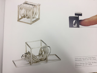
OUGD502: 5 Week Silversmithing Course

Starting the new year I set myself a goal of exploring new things. Recapping on my Level 4 ambitions, I said how I always wanted to design and make a piece of jewellery, so thought this would be a good additional skill I could incorporate within my knowledge. The aspect of creating 3D type is also of interest to me, as well as seeing how typography could be created through metal. As I still have another year and a half left of LCA life, I want to make the most of the facilities whilst I can and learn from the technicians whilst I'm still here.

The course was lead by Liz (jewellery maker and tutor) in the LCA metalwork department as a night course, (of about 12 people), the basics of making silver jewellery. This process includes annealing silver, soldering with borax solution, placing the item into an acid bath and eventually shaping, cleaning etc. The process is a lot to take in so I made notes throughout the sessions in order to keep track. Much like graphic design, jewellery design has its own field of terminology, as well as necessary equipment for conducting a proper practice. Throughout this year I want to build on the aspect of 'craftsmanship' so I want to try and become as technically competent as I can with Liz's help. The 5 week course was a great opportunity to throw myself into a design craft I have not yet tried, that can still have possible relationships with my course of study.

Initial research

Inspired by the fluid shapes of designers and architects such as Zaha Hadid, silver can be transpired in many ways to create formal contrasts. Jewellery has an appeal as it is wearable art. A statement of design on the body, which must integrate aesthetically and functionally on the wearer, and therefore must have as much consideration as any other design output.


First experiment with 925 Silver, thick silver ring.


From doing all of this I have learnt how the design processes can differ, yet how design is actually all very similar, starting off with sketches and research, progressing through embodying attention to detail, functionality (wearability), aesthetic quality, budgeting and planning.

The business of design can be centred around a product. This can expand to creating my own brand, packaging, collection etc, as well as expanding my skill in craft, budgeting and business awareness. All of this personal development is allowing me to determine my strengths as well as profitable but passionate routes of design, as hopefully one day I want to start a business. Considering raw materials was also something I had to learn, making sure I ordered exactly enough (to the mm), working out the cost of silver by the gram and how much jewellery I could make with that. This meant considering what I would be making (planning), as well as deciding for who (target audience), and getting measurements and designs ready (research&development). If all of these were not right then the jewellery projects would not come together and money would be wasted. It is also good to learn about suppliers and resellers, with certain types of silver being priced at different weights, and when to use high quality 925 silver, and when not. The whole course was a great learning experience, yet since practicing on my own I have found a self-taught path for design, using Liz's basics. 

Since this I have actually had a request for a necklace commission from a boutique owner in Harrogate, so will be sending her over a necklace (pricing to be negotiated and accurately calculated using what I learnt in the LCA business summer school). It may also be good to send her over a nicely designed thank you note or additional jewellery free of cost. It is also an idea to give her this piece free with a possible business arrangement in mind ensuring repeat custom- e.g.: her boutique will have a free sample and first refusal of all pieces for X amount of investment?


THE FUTURE:

Goldsmiths Jewellery Fair (basically the D&AD of the jewellery world)- the place where up and coming jewllers feature, London trade show
Set up Etsy or made to order
Define brand, design and produce packaging
Jewellery exhibitions around the country/documentaries/contact professionals?

Monday, 30 January 2017

OUGD502: North West Opera Studios pt.2

After creating some posters for them last year and over some, I continued to do this when returning to university. The experience with them taught me a lot, as they were very demanding and contradictory in a lot of ways. 

I wanted to portray an operatic scene, photographed and re-worked. This way I would have a range of images to use for a range of designs, including social media and larger one off posters.

Setting up the scenes

I shot in a range of places, ensuring a clean backdrop each time, these were purely to work out the composition. Sadly since this I have lost all of my work, prior to blogging about it, but I am in the process of getting it back.


As I have a personal connection with the woman who commissioned me, we agreed on a 10 day time period to also accommodate for university work and troubles in my personal life. However, since agreeing to this time scale deadlines were unrealistically brought forward to 3 days notice. As I was on a bit of a creative block at the time, I took inspiration from the theatre and set design, as well as other influences such as Bergdorf Goodmans Windows, and chose to do something hands on. 

I discussed my idea's and concerns with Debbie and Anne and they said to do what was possible, so I went to the shop and purchased some flowers as props for £7. The rest of the props were locally sourced from my shared house and printed on black and white 2p paper in LCA. As the cost was only small, I mentioned it when sending over the finished work and they refused to pay that small fee. I am aware I agree'd to work for free, however their actions made me really question my self worth, and that if what I produced isn't even worth £7 by someone who supports me then it won't be worth £10 to anyone else. 

Monday, 23 January 2017

OUGD502: Vogue x Hitchcock Editorial

The Vogue x Hitchcock project was a collaboration with a group of Level 5 Photography students. Their task was to interpret the movie 'Vertigo' by Alfred Hitchcock through pastiche, creating a series of photographs fit for purpose in Vogue. 

I was brought in on the process initially for help resolve the concept, as well as do the graphic design work. When the model dropped out last minuet they decided to cast me instead, meaning I had to channel the inner character we have been working on so much conceptually.


Styling the shoot


Photoshoot Call Sheet organising the day


Saturday, 21 January 2017

OUGD502: Making Notebooks

As the bookmaking moduel in 504 was interesting me greatly, I wanted to explore creating a range of little notebooks using the bookmaking skills I've been practicing.

I have recently purchased a printer with a thick stock bypass trey, so I decided to create my own print and create textural covers, as well as sleek hardbacks using grey board and PVA Glue.


The experience was very rewarding as it taught me how precise you need to be with measurements. The initial concept was to produce a small illustration, used on a range of things. The execution of the idea and production was very quick- something I need to allocate more time for in the future. Bookbinding is still something I need to work on I will continue to push this further throughout the year, possibly making a zine at some point.

Monday, 16 January 2017

OUGD502: Contacting Creatives 02

Helen Russell Brown is a tutor at Leeds City College, specialising in set design and construction. After exploring an interest in window displays and highlighting craftsmanship as a key ingredient to a successful window display, I felt that contacting a creative based around this area would be of benefit to my practice. I have been told Helen has worked on major Broadway shows, as well as helped construct fashion displays. 

Helen is not really somebody I want to interview for my creative report, yet I feel that she can provide insight into aspects of the the creative industries I have not previously explored, and so her insite and possible contacts are promising. 


We arranged to meet up on the 22nd December and I prepared some questions as well as interest in her personal background:-

- How to you go about creating a set?/ How is the design process different to that of other medias?

- What is the relationship between design and construction?

- What is the process like constructing set design for fashion?

- I can imagine numeric accuracy is a large part of the job, is that a large pressure or do things get double checked?

- To what extent do you have creative control?

- How important is collaboration and placements within theatrical design and graphics?

- What is the relevance of graphic design on catwalk design


Sadly, Helen and I had to cancel our meeting just before Christmas due to personal extenuating circumstances. The implication of these circumstances also meant meeting with Helen was not possible for quite a while after. Looking back on this experience, I wish I had contacted her back (about late Jan) to follow up and rearrange an interview, as I feel I have really missed out on an opportunity not meeting Helen; but everything happens for a reason.


Monday, 9 January 2017

OUGD502- Design Presentation

Current graphic design which is inspiring, with regards to Studio Brief 02 

Club AVi’s XII-year Anniversary Posters Series


Political Posters

Free Press, Paris, May 1969


The simplicity, directness, and clarity of mind displayed in the Paris 1968 posters is distinctly impactful. While this poster's visual style is primitive at best, its message is extremely sophisticated and encouraging. On one hand, the poster conveys the idea that the press is controlled by the police, the authorities, the state, and nothing but the police version of 'reality rolls' off the newspaper presses. On the other hand, the poster is telling us that a truly free press squashes police state lies and government fabrications.


The New Yorker cover (Feb 13 & 20) by John W Tomac.


"The magazine has always used its illustrated covers cleverly, switching weekly between lighthearted seasonal visuals and harder hitting political observation. Both types of cover appear without comment or headline,