In collaboration with Beth Sonnethall, Level 6 Photography, I have been commissioned to produce a series of zines- for sale- communicating Beth's nostalgic 35mm pictures. All the photographs are in black and white, with tonal qualities contributing massively to the emotive qualities the images are suggestive of. The aspect of collaboration is something I have identified as something necessary from success, especially when listening to the visiting speakers discussing self initiated work.
In initial talks with Beth, we discussed the best way to market the Zines, considering the wider marker not just the purposes for her university project. We decided that a set of three as a collection would be easily marketable and more desirable as a photographic, collectable item. Despite the chronological sequence being Tokyo, Paris, Madrid, we considered re-ordering them geographically, with the closest distance first and each edition exploring a part of the world further away. With this in mind, the series will go Paris - Madid- Tokyo. Beth had the idea of an extremely bright cover to offset the black and white content. I am hesitant to go down the vibrant route, yet will start experimentation by looking at pastel tones in reference to each city. As colour was a big point of conversation in our first meeting, I suggested making three mood boards, epitomising the colours of each place. With this, I can simply colour grab the selective colours in order to simply communicate the essence of each place. I feel the collaborative process is going much smoother with Beth than it was with Katrina, as Beth is willing to put in a bit of work for herself so to get the most out of our brainstorms.
 |
| Paris Colour Palette |
 |
| Madrid Colour Palette |
 |
| Tokyo Colour Palette |
From this, the option of printing on coloured stock, coloured bookbinding tape, or implementing the colours digitally became options. By undertaking the bookmaking module (504) I have gained experience in bookbinding and how to physically produce editorial content. I am partial to the idea that a thick (300gsm perhaps?), thick coloured stock could be used for the covers, reducing cost and meaning the only ink printed it black. This wouldn't require a full CMKY print, yet only require a spot ink- fitting into Beth's student budget requirements. The considerations of cost are something I am keeping in mind, fitting the brief and learning from the clients requirements. The print induction taught me about spot inks, and this could even be translated to screen printed covers, allowing a wider range of colours to be translated onto a wider range of stocks.
Beth asked for 'my style' with regards to the cover. As she wants the editorial to be completely text free, we discussed the idea of having a purely text based cover to offset the absence of words inside. One design is a hand rendered, typographic solution with the title and issue number. The typographic style would be continued on the back, including photographer and editorial information. I have been inspired by a book I purchased at the Tetley Book Fair, and wanted to see how heavy typography would work creating an initially overpowering, ambiguous aesthetic, yet the information is in front of the viewers eyes the whole time. The hand rendered style also conveys a personal touch, highlighting the brief's holistic aura.
Initial cover ideas//
When showing these initial designs to Beth, she was really enthusiastic over the hand rendered quality, yet thought this would work better as an inside cover- looking at it from an step back, actually really works. By gaining feedback I was able to understand more what she was after, stepping back from typographic play.
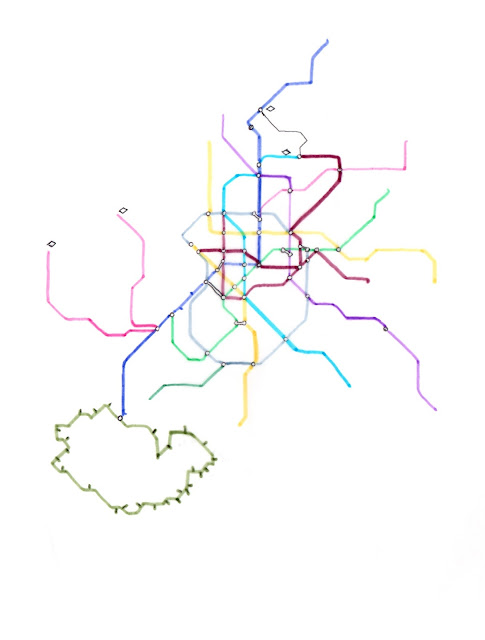
Exploring the idea of maps for the cover would visually represent the place of in a slightly different way appose to photography or type. This is something I am quite interested in, and the idea of a map could go in numerous ways.. obvious with streets and possible 3D illustrative aspects (e.g.: Eiffel Tower perturding out of the map), incorporating postmodern typography or hand lettering, exploring the underground map of each place as a common linking factor, or representing the historical qualities in a traditionalist manor, using the principles outlined by Ruth Johns. This style would also give a cleaner look, which could be combined or used singularly as part of the cover series.
Following on to this, I asked if she had any personal branding or photographic identity, to which she said it isn't something she'd really considered before. She does not plan to make a proper career in photography, yet wants to make money on the side as a freelance photographer and selling documentary publications. As I am quite pushed for time at the moment, she's asking a Level 6 Graphic Designer to create an identity for her, which will possibly feature on the publications outer sleeve/covers, promoting her alongside the zines. I have learnt that it is imperative to get your name out there somehow, and not be shy restricting your work to in-university use only.
 |
| Paris Map Vector 01 |
 |
| Madrid Illustration 01 |
 |
| Madrid Illustration 02 |
 |
| Madrid illustration 03 |
Cover Developments //
1) Bookbinding tape to add colour. Central composition to allign all the maps at the same level, giving a minimalistic aestetic. The covers could be printed on coloured stock to remove the idea of bookbinding tape, as it will be difficult to get the exact shades. (colour was colour picked from Beth's palettes). When looking spine on, the colour palette is suppose to suggest a nostalgia (referencing the images) and similar to 1970s colour combinations.
- Bookbinding tape requires perfect binding ideally
- Slip cover or tracing paper overlay to keep as a trio?
- Printed on coloured stock
2) Opacity Series
Combining all three maps onto the cover in slightly different ways for each cover. The opacity remains 100% for the map (and zine in question) and fades out when showing the other two maps. I thought this way would allow all the illustrations to be visible yet maintain an element of difference per issue, and tie them all together in a more fluid way.
By developing a range of outcomes and partaking in regular feedback with peers in graphics and Beth, I was able to maximise the creative process and go about a collaborate brief with the same development as I would for a university brief. The collaboraive process with Beth has been extremely positive, making me inspired to work with more Level 6 photographers, and possibly practitioners from other courses. Fashion is my personal interest, so if Beth knows any fashion photographers who need assistance with art direction then I expressed an interest to get involved, perhaps producing an editorial or collaborating on my own fashion concept. I have had to project manage this brief so it did not interfere with my university work, managing time effectively to meet self led deadlines and deadlines for Beth. I contacted GF Smith for stock, organised editorial content and created well organised packages for Beth. This has increased my organisational skills as well as drive to get involved with self initiated work. I have noticed I am much more interested in helping other people, wether thats paid or unpaid, often neglecting my university studies in the pursuit of this. I need to take what I have learnt (time-management wise) and apply it to my uni briefs.


No comments:
Post a Comment