Tuesday 15 March 2016

OUGD402 // Reflection Presentation


Feedback //

Penny and Simon loved how inspired I was from Lord Whitney,  leading me to create my own set in a mock up style. It was advised that this is definitely something I should do more of and push in the future, incorporating tactility and photography where relevant. In addition, it was mentioned to explore the style of Malika Favre (Vanity Fair cover) who incorporates a strong subtle concept alongside a sleek illustrative style. Both tutors also commented that with regards to the consistency I should have mentioned conceptual qualities further throughout- I feel this defiantly let me down as the pieces I included (Opera Poster/ Album Cover) do have a strong concept, yet out of time/nerves I completely skipped over this- something I need to work on in future presentations!

However, time management was a problem as I went over my allowed time (don't know how that happened) which is definitely something I need to work on in the future. Furthermore, I didn't follow my speaker notes out of nerves so didn't actually mention some of the key points (strengths/weaknesses etc) which I feel I needed to communicate, e.g.: I didn't know the pen tool until 1 month ago! It was also raised that I should not worry about 'what graphic design is', because fortunately there is no right way to conduct graphic design.

Despite having the flu and croaking through my presentation, I feel it went better than expected because of the relaxed environment and constructive feedback given from both peers and tutors.

OUGD402 // Self Branding Evaluation

From my research I concluded I wanted to explore minimal but attention grabbing forms of communication. The IN BED project was perhaps my most influential with regards to type connotations, due to the sleek modern suggestion contrasted by a subtle nostalgic mood. 


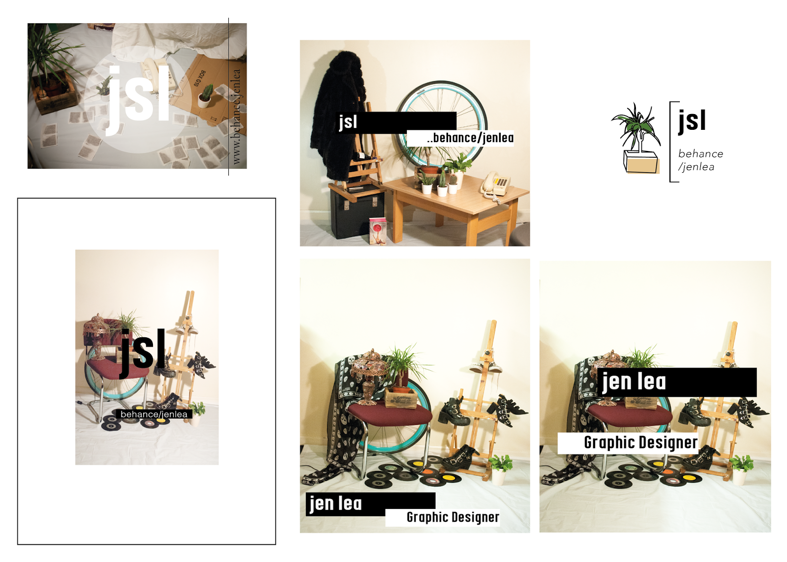
The use of photography in the IN BED advertisements possibly subconsciously lead me to conduct my own photoshoot, overlaying place holder text of a possible brand. This was my first set of compositions yet I feel they lead to a successful discovery when settling on the tag 'plant life creative', implementing my favourite plant Betty as my icon. This simplistic approach fulfilled my initial intentions, whilst relating to my personality and offsetting my brand away from a 'student' disregard. Despite this range of compositions not necessarily being the most professionally conducted, they definitely served their purpose as a starting point, leading me to the plant concept.


After this came the brand guidelines. Instead of guessing who I am I asked a range of peers, both within the design community and without which colours best represented me as a person. My typefaces were chosen to echo modernity (DIN), juxtaposed with a hand rendered nostalgic quality (Courier). The type is naturally an integral part of my identity, with Din being used for headers and important information, whilst Courier is only intended for body copy due to the type writer effect giving off a traditional vibe, tight kerning is preferable to keep consistency and reduce the line length.


Conclusion //

My aim for self branding was to represent who I am as a designer at this stage within practice. I am very conscious that I am new to the subject, having come from a very expressive and textile based background I was attracted to graphic design due to the ease of printing, rather than embroidery or traditional printing. Because of this, I wanted to keep my design predominantly flat and digital as I feel my traditional skills (screen print/ letter press etc) are not strong enough from a graphical point of view to include successfully. As my aim was to work digitally, this lead me on to utilise social media and create a GIF rather than tangible business card as this best construed where I am currently within my design practice.

Is my outcome successful? Yes and no. Overall I am pleased with the final logo, typeface choices and colour scheme as I feel they defiantly convey my personality and design character within a transferable sense. The versatility of the colour scheme and type range can be recreated and altered for any project or layout, yet ultimately provides the foundations and a 'guideline' to show consistency through communication. As I am still learning, I do not expect the illustrative business card or GIF to be forever, yet it is appropriate for where I am at now. Despite this, I am conscious that I have nothing physical to show. If I managed my time better and decided on a final outcome sooner (to have something to plan towards) then it is possible to have screen printed notebooks to send out to design agencies to hopefully attain a small placement. In addition, I could have physically created a hand stamp, possibly out of lino to physically show my idea. I feel I let monetary factors impact the outcome of my work, as when the stamp idea arose it was slightly out of budget meaning I didn't push it further and get it professionally made. With hind site, I regret not just biting the bullet and finding an alternative solution to the problem enabling me to push my work further and achieve a more successful outcome. As my intentions are to showcase where I am at present, I do feel that this is reflective of me as a designer, yet this is constantly evolving meaning it may become outdated fairly quick.

When considering the purposefulness and why I have created a letterhead/ business card and GIF/ invoices and Instagram, I asked myself what I wanted to achieve? Personally, I do not feel I am ready or at the standard to undertake a serious placement just yet, but defiantly want to get myself out there to build up confidence before taking that as a next step. Moreover, by conducting photoshoots and collaborative illustrations I was able to explore other styles rather than 'Graphic Design', whilst interacting and collaborating with different subjects and ultimately broadening my skills.

I feel my time keeping could have been improved to achieve a stronger quality of final resolution, so this is defiantly an area I am planning on focusing on in the future. Prior to starting projects I do plan time (mentally and in note form) week by week, yet I have learnt that I get too distracted by one element, for this brief being patterns and typeface choices, thus making my time plan no longer relevant.

Overall I am happy with my final self branding guidelines especially, yet do wish I created a final tangible outcome of some sorts. This would have forced me to send it out and interact with industry on a personal level, subsequently building up my confidence and personal concept.

OUGD402 // Custom Patterns

After researching brands etc, I thought it best to create a pattern relevant to me as a creative. After coming up with the title 'plant life', I felt exploring a botanical pattern route, or incorporating some sort of nature was the best way to go forward.

Initial Sketches

Traced sketches on illustrator using the Pen Tool. After re-drawing out each component, I created this placement print outline.

Formulated to a repeat pattern

Placement print with aspects of my chosen colour scheme. The vividly of the Cyan and deep red are contemporary and contrasting, whilst the green and brown shades are more traditional in their colour ways. This contrast hopefully showcases me as a designer who is willing to take risks, alongside incorporating both traditional knowhow and values, combined with a 'random' contemporary element.
 Alternative colour variations //


To implement this for my self branding, it is possible to screen print/digital print the pattern or sections of the pattern onto note books to give out. This would also work as a tote bag print, phone case or even sellable as limited edition prints. 

Wednesday 9 March 2016

'Branding a Friend'

In conjunction with our personal branding, the opportunity arose to brand a good friend, Thea. As this was only a day brief the finish quality is not as detailed as I would prefer it to be, but for the study task criteria mock up form seems appropriate. 

The brief from Thea was to create a small publication that shows off her current skills and her as a person. She said "My current idea is to have the front cover as a representation of me, the inside as where I am now and the last page to include my details etc to insinuate my next step". Essentially she want this 'journey' idea to come across without being "too cringey" and "to make it effortless!". Thea is currently exploring bookbinding, stencils, cutouts and photography and image- a good starting point when considering content for the book.

Initial ideas and mind mapping //


From Thea's brief, I intend to conduct the small book with a narrative flow of how her work has progressed over the years. This will include examples of all the criteria she wanted to include (photography etc), alongside skills she has learnt along the way- including the creative cloud and traditional processes.

Initial digital mock ups //

As Thea wants the front cover to resemble her, I took an illustrative spin to this whilst considering her digital style and personality. As Thea generally wears a lot of stripes (to the point it has become a running joke), I thought it appropriate to include this on both the front and back cover, segmenting them away from the interior content. This could be taken to the next level and printed on a hard back/fabric cover to further highlight her personality. I intend to keep the colour scheme fairly minimal, reflective of Thea's personality. I feel black and red are the most appropriate, partly as they are her favourite colours but to highlight a feisty tom-boy side, which is still strong and feminine.


The front cover (top image) is a abstract representation of Thea herself. The stripes act as a striking background to grab the viewers attention, with the black jeans/docs a staple in Thea's wardrobe and identity. I have removed her torso and head to create an ambiguous illustration, with the 'arms' shown in a fluid way to also possibly look like long eyelashes, complemented by the flicks. The white circle on the left is to highlight the 'arms', as without it the red severely overpowered the black. If you see eyelashes instead of arms, the white circle brings a humorous tone acting as a monocle, suggesting that Thea investigates every aspect of design and is critical of her own work.

Ransom note inspired type presented in a softer, intriguing way. If I had longer I would have selected a more appropriate typeface, yet due to the collage aspect of her work I felt a unlined composition was the most important factor to include.


On the image pages, there is a subtle outline in the style of the gig tickets. This reflects Thea's interest and passion in the music genre, whilst making the viewer seem VIP for receiving a invite.


Finished booklet in digital format //

All images are of Thea's work sourced from her and from her blog...


Overall for a day brief I am fairly happy with the outcome, which if produced properly would be printed onto a recycled stock and hand stitched. If time was no constraint I would explore the most appropriate type choices to represent Thea, alongside possibly experimenting with laser cut/stencils further reflecting her interests.

OUGD402 // Finalising Self Branding


Final Brand Guideline poster. This explains the chosen final logo, two typefaces alongside justification and the intentions for use. Below is the colour pallet, arranged into two sets of three. The smaller white/nude/black are simply complementary colours, which will be subtly integrated throughout all aspects of design, wether it just be the stock colour, background or the fill of the logo. For my personal colour scheme I have chosen three (instead of the preposed 5), mainly to keep my structure simple and consistent. The deep red/cyan/dark green have all been chosen and combined to reflect different parts about my design style. After asking many peers what they feel is most appropriate, they all said to keep the tones dark. I took this feedback on board with the deep red and green, with the green being necessary to relate to my Plant Life Creative tag. However, as I have a playful and experimental side, I chose to incorporate a vivid Cyan to add some life to the deeper tones, whilst being reflective of my personality and artistic style. All Pantone colours are presented below, alongside my Instagram and Bechance tags. 

Final letter head template //

As I intend to do things the 'proper' way with regards to conducting business, I feel by creating a letter head template ahead of time will allow me to step away from the computer where relevant, especially when introducing myself to prospective internships/engaging with different companies. 


Final Invoice Template //

Similar to the letterhead, the creation of an invoice is essential when it comes to selling work, with all designs adaptable for a 'Invoice' or a 'Receipt'. I assume at this stage this will be attached onto emails as a PDF, yet if traditional modes of communication are had between the client and myself, then I will opt for a printed version. With this in mind, I tried to complement the colour ways and composition with my letter, as when printed they will naturally accompany each other.

Alternative invoice templates //

These have been less successful due to the overall design and lack of 'formality'. When trying to choose between them, I again asked peers which was the most effective and it was raised that the grid gives a mathematical structure, whereas the bottom left looks slightly like it is floating in air.


Finalised Business Cards //

I opted to do Business Cards instead of my original hand stamp idea, due to the versatility you can create through them. A hand stamp will come off over a few hours yet after asking peers, both from within art school and some completely un-interested in design, it became evident that people will hold onto something intriguing and fun for a lot longer than a boring piece of information. Taking inspiration from 'Good Stuff Design', I thought this was a good opportunity to showcase illustrations and playful 'weird' aspects of design for people to keep.
Instead of a printed business card which would just sit in my pocket or gather dust, by creating a digital business card (initially in the form of a GIF), will be easier to share and project over my social media platform. The whole point of my self branding is to gain confidence to show my work, whilst getting my designs out there and hopefully getting noticed by a established design blog.

Business Card GIFS // 


Possible photographic advertisements //

As a way to utilise my self branding photoshoot and variations of my repeat pattern, I have drafted photographic compositions to showcase my 'brand'. I intend to share these as digital images, and possibly make them into posters in the future.


Final images //


OUGD402 // Self Branding 04

Exploring type to pursue 1 (max 2) //
Colour options and development for personal branding //

Wanted to incorporate a lime/green/mustard of some kind to link to my alter ego, plant life.


Type development 1//


Possible compostions// 


Making it more personal/custom // 


 // Creating a unique pattern, appropriate for Jen Lea and for plant life creative

This is intended for use on possible notebooks, post it notes and any other merchandise appropriate to aid and accompany my personal branding brief. On Pinterest designers explore getting their identity onto a range of communication, ranging from stationary sets to tote bags, introducing themselves via Zines and funky notebooks. This engaging twist involves the viewer further, whilst giving the designs a purpose. If they are appropriate and effective, it is possible to screen print them and sell them via the Plant Life tag.


Creating my own simplistic notebooks, only a few pages thick, to Photoshop my prints onto. This allows us to gage effectiveness of each design prior to production.
Nude to represent a recycled tinted stock, whilst linking to the Plant Life logo colourings. Cyan strengthens the colour scheme by relating to my own personal branding colour scheme, alongside bringing a contemporary and vivid lease of life to the botanical print.