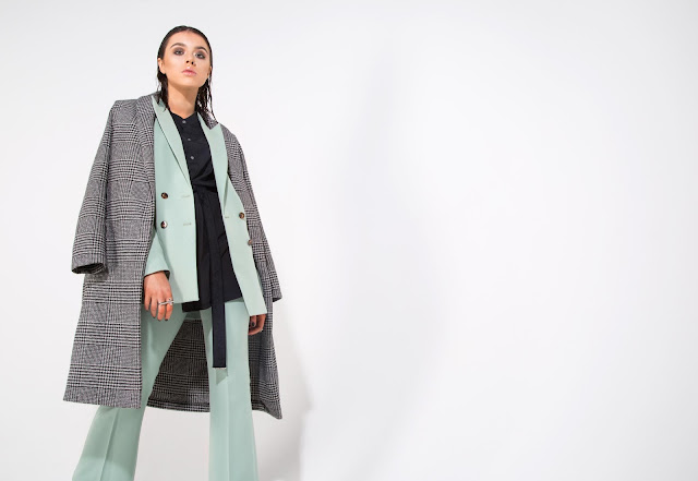
I plan to also get some of my own shots on the day to make use of the studio space - she said the shoot will only go on to 6:30, meaning hopefully the remaining 2.5 hours of that slot is up for grabs - I have plenty of looks at home that I want to shoot, so this is the perfect opportunity for me to get as much content (wether for adverts or portrait/makeup series) as possible for the magazine.
The shoot day itself was actually really enjoyable, Rosie was lovely and I learnt more about studio lighting by helping assist her setting up on the day.
I learnt how to think on my feet more and lead others, as well as articulate my styling concepts and I felt brave enough to say no, that doesn't look right, let's do it like this, which is a really positive step
Images - on the day they looked really good when they were coming up on the computer, but then she sent me over these... . Over edited, awful vignettes and bad colouring on the model Lenny's face. I asked Rosie if she could send me the unedited selects or even just a contact sheet and she said no. I understand that photographers are very precious about their work so it is hard to always achieve the desired result. Collaborating with peoples work you like is essential - so I've learnt not to do things like this again.
 |
| Best of the bunch - add typography. Rate this look. |


No comments:
Post a Comment